It has been a long time since JackThreads last updated our Android app. We all agreed that our Android app looked out of date (it looked like it was designed by a bunch of developers ten years ago, yikes). This project also coincided with Google's Material Design as part of creating a better and homogenous visual language.
The project was led by JackThreads' Director of User Experience and carried out by two Product Designers, including myself. This was a very large, holistic re-design effort on a product that has been using an old visual language for nearly six years. It was also very challenging for the design team, because none of us had experience with Material Design.
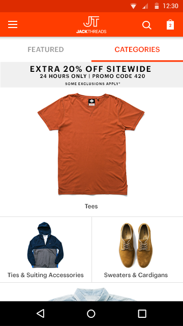
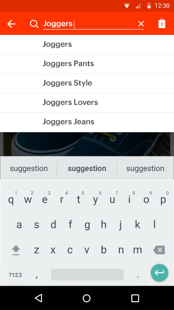
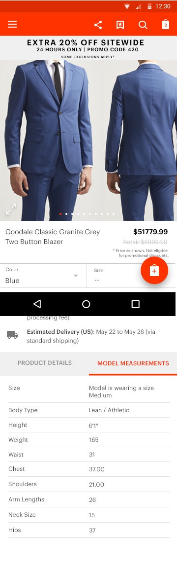
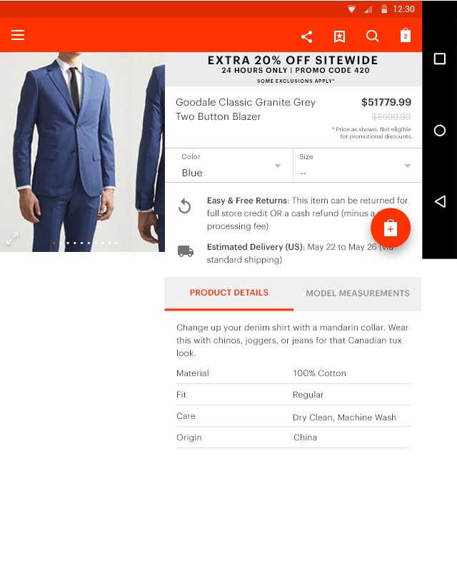
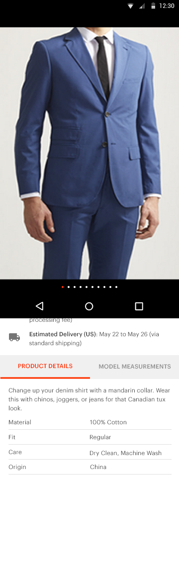
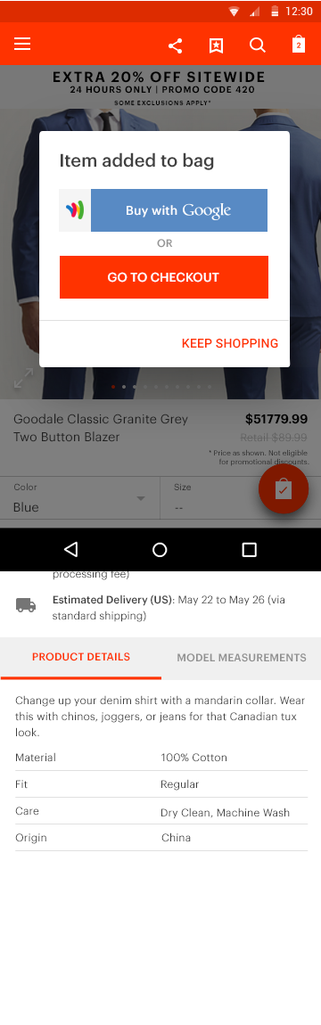
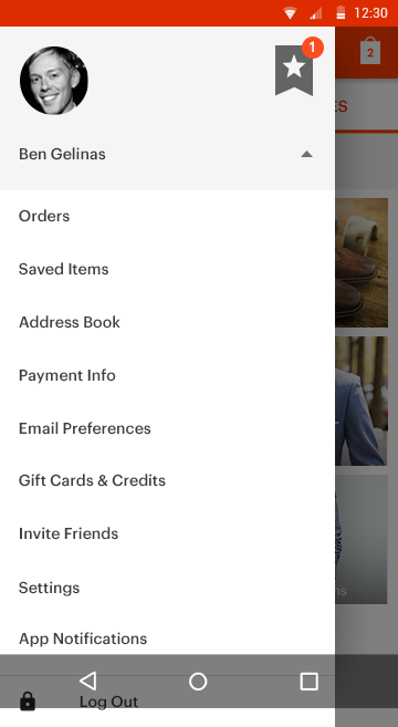
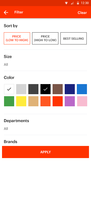
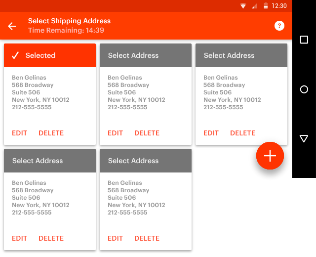
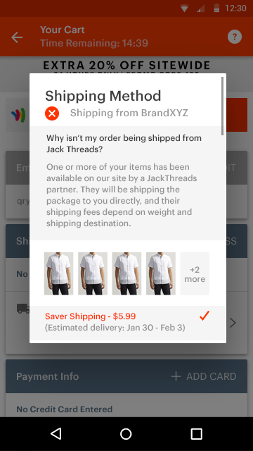
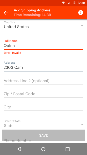
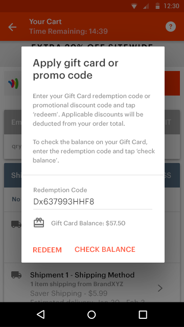
We wanted to create a consistent experience across all platforms. There were many elements on Android that we borrowed from Web. For example, we kept the same layout on the Home, Categories, and Product Detail Pages. We also wanted to borrow a visual language and aesthetic from Google's Material, where it makes sense, such as tab bar, icon's style, floating button, shadow style, ui animation, card element, spacing, bold colors, dropdowns, dialog box, buttons, and text fields.
We presented these design mocks to Google at their NYC headquarter, last year. The feedback was overall positive. They loved the direction that we went and couldn't wait to see the final product.