W. W. Norton Redesign
My Role
I was part of the redesign team working on the W. W. Norton Redesign project. We are a team of three UX/UI designers. I am working closely with my fellow designers to better communicate the brand and improve the site user experience.
Company
W. W. Norton is an employee-owned company that publishes books since 1923. Our mission is to educate and inspire readers, educators, and students through books and digital materials. We have a wide variety of book genres: fiction, nonfiction, poetry, and textbooks. Our products receive admiration from readers, and have been widely-known in the industry. Unfortunately, our current website does not reflect the quality of work the company produces.
Goals
1) Modernize the site's look and feel
2) Provide a product experience that exceeds customer expectations.
3) Represent a brand.
Findings
W. W. Norton had worked with the design agency Blue State to come up with a sitemap. In order to do so, interviews with users had to be conducted to better understand their needs. What we found out were
1) Users most often come to your site to accomplish specific tasks, rather than to browse or seek inspiration for future reads. Most visitors skip the homepage and go straight to the section they need. Visitors that do visit the homepage bypass featured books, going directly to sign-in, search, or navigation.
2) The heaviest traffic to your site comes from college students and instructors. In fact, 84% of the users are students and professors.
3) There are some specific ways that the current site doesn’t address the needs of your most valuable audiences. Ex. The current navigation structure is complicated and confusing. Search is a key navigation tool, but it doesn’t work well. Visitors interested in signing up for newsletters have to dig deep. Site loading time is very slow. Too much text and fonts are too small. The site is not mobile-optimized. Just a few.
Design Studio
Design Studio
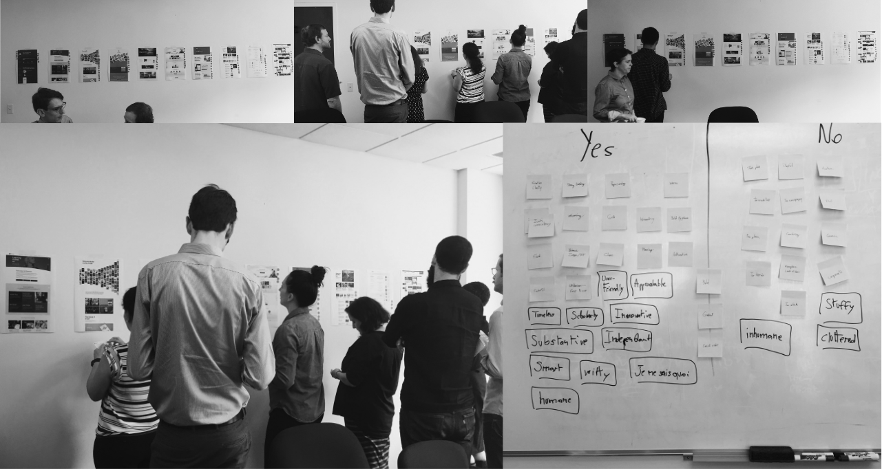
The visual design started after the sitemap was delivered. Since the visual design is subjective and there are many stakeholders involved in this project. We kicked off the process by having a design studio. The design studio process is the following
1) The designers printed out 10 various websites (from visual perspectives) and posted them on the wall.
2) The stakeholders then had a chance to dot vote them. Each stakeholder has 5 likes and 5 dislikes.
3) The designers asked the stakeholders to explain why they liked or disliked certain websites.
4) The designers asked the stakeholders to come up with the words (adjectives) they want our website to embody.
The design studio was very successful. In the end, the stakeholders agree on five adjectives: Clarity, Clean, Pleasing, Timeless, Welcoming.
With this vocabulary in hand, we crafted and then refined a concept that we believe is more open and less cluttered. Timeless and modern.
1) Modern from a technical standpoint, being mobile responsive and accessible.
2) Timeless from a design perspective, using a modular system to allow flexibility for growth and change.
3) A clean aesthetic that is engaging, readable and inclusive.
Evolution
Below are some of the explorations the design team had created.
Final Visual Design
The final visual design aims to embody all five adjectives that were created in the Design Studio. Blending organic content with clean and crisp UI was a challenging but fun problem to solve. The book covers are the main protagonist here, creating a lot of opportunitiy to bring life to UI screenshots.
Home Page
Product Detail
Author Page
Landing Page
Sub-Landing Page
Catalog / Search


