Insights
Insights is a new 0-1 product offering from Parsley Health. It features a more self-serving plan than our previous paid membership ones. Insights gives our users a glimpse of Parsley Health’s core value proposition without cost. It bridges the gap between paid membership and a marketing website.
Business problems
Slow conversion rate for the paid membership plan (Complete Care costs $175/month for the monthly plan).
User problems
The value prop is not clear to me.
Is Parsley right for me?
I’m not that confident in signing up just yet.
How does Insights solve these problems?
Providing a taste of working with Parsley without cost.
Ability to upgrade to a paid membership when the value prop is clear.
Business: cost efficiency (no human service cost).
Bridge the gap between paid membership & marketing site.
Our team
1 Product Manager
2 Product Designers
1 Content Designer
1 UX Researcher
5 Engineers
Process
Discovery (user research)
Ideate (brainstorm workshop)
Scope planning
Design review with the team
User testing
Handoff to the Engineering team
User research findings
Here are the results from our user research interviews:
What are the most pressing problems for our users?
Our users are looking for empathy from their doctors. They want to feel heard.
Why are the users are or aren’t interested in Parsley?
They aren’t sure if Parsley is the right product for them.
They think Parsley is too expensive.
How well does Parsley solve their needs?
The biggest gap right now is that users have no way to track their health outcomes.
Design solutions
Click here to see the clicking prototype.
Medical History Questions
After the user signs up for Insights, they’ll be taken to the Medical History Questions portion of the experience. The user answers questions about their health in an engaging and immersive experience. Here are some of the design explorations:
Medical History Results
After the user finishes with their Medical History Questions, they get the health results in various forms of visualization. These visualization health results would give them “insights” into where they have been and where they are at, as well as the recommendations for what they should be doing to improve and optimize their health in the future. Here are some of the design explorations:
User testing
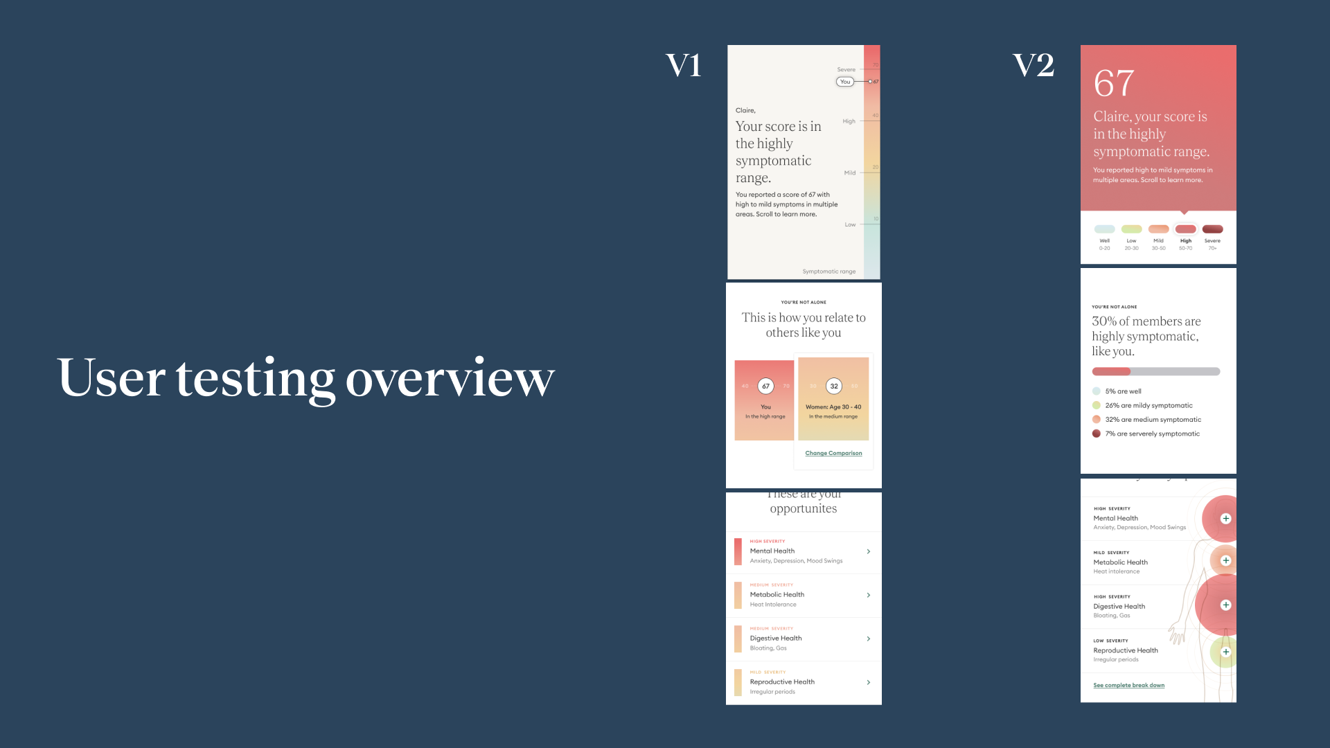
Before launch, we test the Current Symptoms Results page with 2 different versions. 5 users per design (split testing groups) for a total of 10 user testers. Testers are between the age of 25-55 with some college education making at least 75,000 combined income.
User testing results
Both designs tested well with no statistically significant winner. Users rated highly on clarity and loved the clear explanations of modules on the page.
Changes we’ve made based on the feedback
One user mentioned we should consider moving up the breakdown section for more context.
What does success look like?
For the beta phase, about 1,000 potential customers are invited to use the product and provide feedback. The success metric is that 2% of traffic to the landing page will sign up for the product.
Learning (week 1)
Completion stats:
148 users entered to start the experience.
91 completed Medical History Questions.
89 landed on the Current Symptoms Results page.
53 landed on the Future Recommendation page.
6 users converted to paid members.
Next iteration
There’s little context of what the user might get out of this product in the beginning of the experience. We should do a better job of exciting them about the end results.
The user faces many medical questions without knowing what comes next / seeing any insights. Also, the most valuable piece is at the very end of experience. We should consider giving them ‘insights’ sooner into the experience.


