What problems are we trying to solve?
Parsley Health is a health care service that helps people with chronic conditions get better through personalized care and holistic approach. Over the past few years, we have grown tremendously as a business and transform the way people think about holistic medicine. Our website does not clearly explain Parsley, making it hard for users to make a purchase onsite. Providing easily accessible, critical information for purchase decisions and clarifying Parsley with our new positioning will increase conversion.
How do we know this is a real problem and worth solving?
• User research: when asked how Parsley works and what would they get after signing up, only 3 out of 6 users give correct answers.
• Currently users require ~22 site visits before making a purchase.
• 77% of customers report hearing through Parsley from word of mouth, but this will decrease as we expand. We will have less-educated users coming to the site.
• High volume topics on consult calls include basic information including how Parsley works, what we treat and where we’re available.
Website redesign goals
• Clarifying our brand message and product
• Driving an increase in conversion: CVR+ and consult calls
• Build the site in a new self-service CMS where the marketing team can create pages without dev team.
Part 1: Define navigation
Our process
• Define top level navigation direction
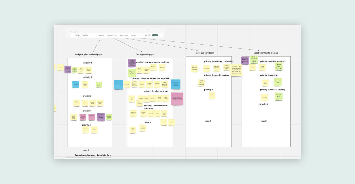
• Defining the goal of each top level page
• Prioritizing their contents on each top level page
Key friction points in our existing site architecture
• Best practice is to have 3-5 nav items (we have 7)
• Not scalable way finding
• Not clear what each label means - what’s the difference between “How it works” and “About?
Top navigation direction
• We chose to move forward with a minimal top navigation to convey a strong POV, minimize decision fatigue, and lead the user with content.
• Breadcrumbs are used as a secondary navigation, helping users understand where they are in the site.
Part 2: Content strategy
Our process
• Collaborated with the marketing & brand team to define and prioritize the content strategy on each top level page
• Build a site map based on the workshop output
• Create the wireframes to present to the executives for approval
Workshop
Workshop to determine the goal and content priorities of each top level page
Sitemap
Wireframes
Part 3: Page design
Design explorations
Final Design
Homepage:
Goal to summarize product value and lead user to purchase
How it works page
Goal to explain our approach to medicine and how it is different
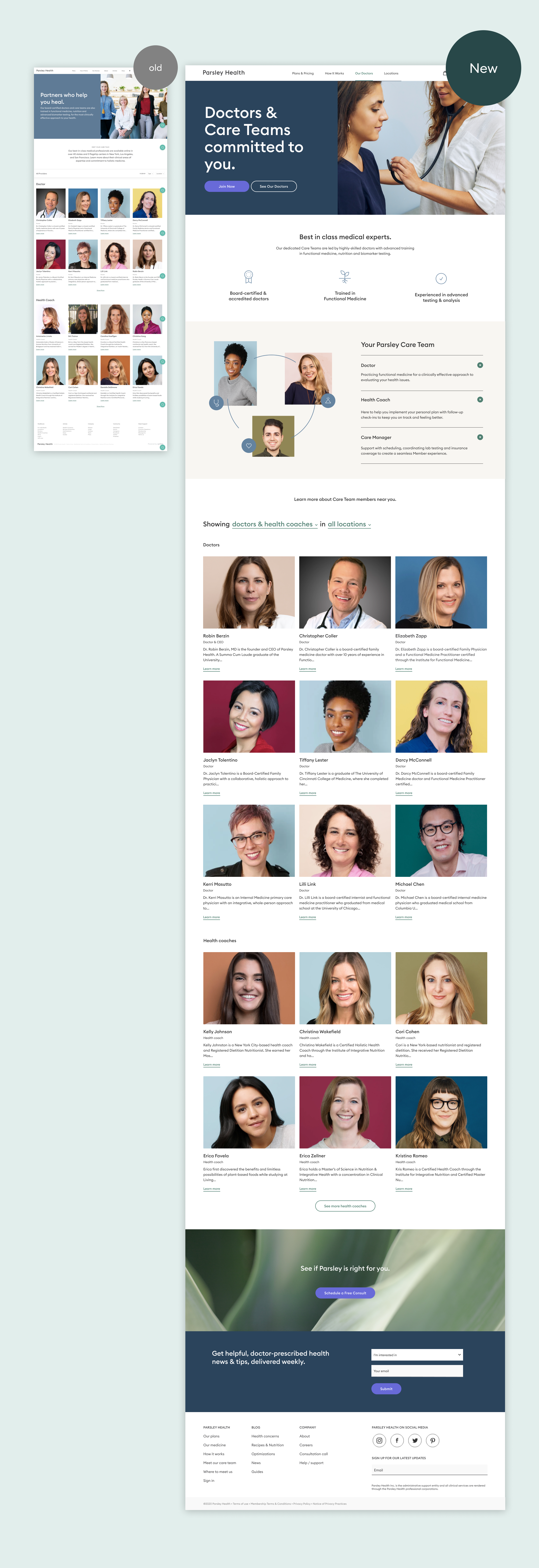
Doctors page
Goal to introduce users to our care team. What makes our care team different, what is a care team, and who are they?
Locations page
Goal is to show users where they can connect with us online or in person.
Mobile
Part 4: Design system
We want a design system that
• prioritizes the best web practice and ADA compliance.
• crafted to feel uniquely to Parsley Health
• aesthetically feels consistent and cohesive on every page
Part 6: User testing
We tested users selected with the following criteria:
• Income of $75,000 or more
• Female age 30 to 60
• Has bought something online within the last month
• Has experienced health issues that have impacted their quality of life within the last year.
Test goal - content comprehension on the main landing pages.
• Do they understand what Parsley is (Homepage)
• Do they understand how Parsley works (How it works page)
• Do they trust Parsley doctors (Doctors page)
• Do they understand where Parsley is located & how online works (Locations page)
Test format
First: comprehension
We ask our participants comprehension questions (Ex. do you understand what Parsley is) after they finish scrolling through the page.
Then: rate the page
At the end of each page test, we ask them to rate the page on scale of 1-5 based on overall information clarity.
Test result summary
People love the new design. The average overall rating is 4.6/5 (4 out of 5 participants gave it a perfect score)
"Everything is detailed and well laid out. It was easy to navigate. The information is easy to find. The information was right there. And i would say it's customer-friendly"
"I have to say I really like the design of this site. Nice and clean and simple."
“This is excellent. It's very very clear. I love the graph. And I love that it's quite simple and it's not overwhelming with a bunch of medical words that I wouldn't be able to read. It's simple and is presented nice and clearly.”


